Connecting with healthcare providers through mobile apps has become increasingly common. However, many apps fall short in delivering an engaging and seamless user experience. Poor design choices can discourage patients from adopting or continuing to use an app.
As developers working to transform how people manage their health, we must thoughtfully address common UX pitfalls. This post details 12 flaws frequently undermining doctor apps and offers solutions to enhance the patient experience.
1. Complex Registration Process
Lengthy signup forms frustrate users from the start. Ask only for essential information initially - name, email, password. Optional details like medical history, insurance, and payment can be collected later as comfort levels increase.
Keep the opening registration task simple and focused. Most want fast access, not an interrogation. Explaining optional fields helps set proper expectations. Consider one-click login options from existing accounts like Google or Apple to bypass forms entirely for some.
Streamlining signup converts more visitors to active app users. Simplifying personal details honors people's time and privacy preferences up front. Optional data collection occurs gradually through natural engagement over time.
2. Cluttered Dashboard
When users open your app, avoid overwhelming them with too much information all at once. A cluttered, disorganized layout confuses and discourages continued use.
Prioritize space and visibility for the top 2-3 core tasks - such as scheduling appointments, refilling prescriptions, or viewing test results. Filter or hide less important secondary options from the initial view.
Tailor the default dashboard based on frequently used features for each user's profile and needs. Allow customization like rearranging or removing widgets as comfort levels increase. Integrate search functionality for easy access to any buried options.
Provide a clean, focused starting point and then expand functionality as patients engage further through natural onboarding over multiple visits. A simplified dashboard prevents information overload upon each launch.
3. Non-Intuitive Navigation
Confusing or inconsistent navigation wastes valuable time that patients do not have to spare. Clearly label destinations for all tabs, menus and buttons to remove ambiguity. Avoid obscure icons or multi-step processes.
Consider structuring around a dashboard, profile, appointments, medications, billing, and support or help sections as the main destinations. Standardizing terminology establishes recognizable patterns people can easily understand and recall between visits.
Test navigation with representative users to uncover surprises or friction points. Simple, logical flow between pages improves wayfinding within your app. Addressing ambiguous points early prevents confusion down the road.
4. Difficult Search
Search should offer a quick, intuitive route to hard-to-find information. Integrate filtering to help narrow long result lists. Suggest similar or related terms to expand options.
For instance, searching "asthma medication" could surface relevant resources on controlling symptoms plus "did you mean" variations like asthma inhalers or corticosteroids. Filters let people select treatment type, dosage form, or brand names.
Proactively solving problems through improved search helps transform hesitancy into confidence over repeated use. Take advantage of every interaction to strengthen your app's expertise perception among patients. Visit Zipprr Practo Clone App Script.
5. Lack of Personalization
A one-size-fits-all design insufficiently addresses diverse user needs. Tailor the experience based on each person's unique profile, health stats and care goals.
Allow saving personalized settings like medication reminders, dashboard widgets, color themes and more. Integrate with health tracking tools for metrics like steps, heart rate or blood pressure. Trigger friendly competition or support via social sharing of progress.
Personalization fosters engagement through gamification elements and satisfying completion of small daily tasks. It inspires accountability while respecting privacy preferences around what details to share. The experience evolves along each patient's care journey over time.
6. Inaccessible on Mobile
With health increasingly managed on the go, a mobile-centric mindset is indispensable. Design for intuitive operation across different devices - mobile, tablet and desktop. Implement responsive layouts scaling content delivery based on screen size.
Optimize navigation for thumb-sized touchscreens with enlarged buttons and ample spacing between interactive elements. Ensure text remains readable without zooming. Streamline multistep tasks into one-tap workflows where possible.
Test your app's functionality and speed across a range of real mobile devices. Address any lags, taps or scrolls required to complete normal processes. Your patients deserve reliable health management aid wherever life takes them.
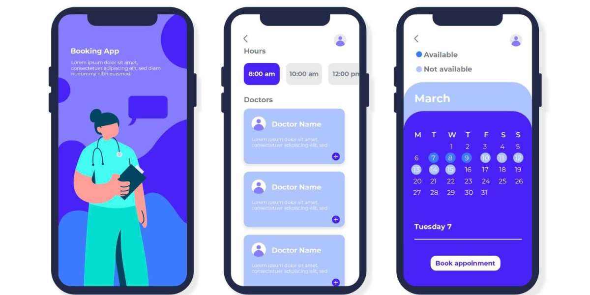
7. Complex Booking Flow
When patients need an appointment, simplify the scheduling process down to its bare essentials. Pre-fill personal details and allow selecting proposed openings directly from an interactive calendar view.
Clearly communicate availability and eliminate unnecessary form fields. Streamline any required pre- or post-booking steps into intuitive, guided flows. Provide flexible payment handling upfront or at the visit.
Effortless booking encourages people to seek timely care proactively rather than delaying due to perceived difficulties. Streamline multistep tasks wherever possible to respect users’ mental bandwidth during health-related decisions.
8. Poor Medication Management
Integrate pill-tracking to help patients take treatments correctly. Set flexible dosage reminders by time or location plus missed dose alerts. Enable reorder requests seamlessly syncing with associated pharmacies.
Surface crucial pill info including side effects or foods to avoid. Warn of potentially dangerous interactions between prescribed and over-the-counter meds. Educate on generics versus brand names, coverage, and costs to empower active involvement in own care.
Proper management yields better treatment adherence and outcomes. Your role is transforming complex dosing regimens into intuitive, helpful routines through technology. Prioritize convenience features assisting people to improve medication knowledge and compliance.
9. No Billing Integration
Show estimated costs transparently upfront whenever recommendations involve potential charges. Factor insurance coverage details to set realistic expectations. Surface applicable coupons or discount programs too.
Enable one-click payment options directly within the app flow instead of requiring separate website logins. Provide receipts and tax forms electronically. Streamline payment histories for personal records or insurance followups.
Financial considerations influence health decisions. Reduce barriers by surfacing relevant data directly alongside medical guidance. Integrate your app seamlessly into the entire patient experience.
10. Difficult Support Options
Clearly communicate ways to contact support from multiple app screens. Offer choices like live chat, email, self-help knowledge base plus expected response times. Consider implementing a support widget or tab always just a tap away.
Responsive assistance reassures patients and empowers continued use. But only commit to realistic turnaround promises that can be reliably met. Frustration grows from unanswered questions more than paid features. Prioritize support quality over surface-level options.
11. Lack of Security
To protect sensitive health records, employ rigorous security protocols from the start. Encrypt transmitted data and stored backups with bank-grade standards. Enable two-factor authentication options to supplement passwords.
Provide a clear privacy policy detailing what user data is collected, with whom it may be shared, and for what purpose. Obtain explicit consent before using personal info beyond the app’s primary functions.
Ongoing monitoring prevents account takeovers from stolen passwords. Earn trust by making security visible through features like biometric login tools. Reassure customers you take digital protection as seriously as their well-being.
12. Absence of Social Features
Leverage the collective wisdom of other patients through online forums, discussion boards and communities. Foster interactions by shared symptoms, treatment types or referrals. Capture advice privately messaged between users.
Cue inspiration seeing others’ healthcare journeys through optional profile followings and progress sharing. Gamify participation through community points and badges. However obtain clear consent and provide privacy controls for any publicly visible account info.
Social connections can alleviate isolation through shared understandings outside clinical environments alone. But prioritize each user’s comfort level around open participation versus anonymity. Approach thoughtfully while strengthening engagement.
Conclusion
The mobile revolution transforming healthcare presents immense responsibility in UX design. While exciting opportunities arise, we must solve problems gently and respectfully.
Continually involving patients early through surveys and usability testing helps validate efforts meet real needs. Their time, trust and well-being should remain the north star guiding improvements.
Addressing just a handful of the issues above could meaningfully impact health outcomes. Focusing first on simplification, security and personalized assistance honors each person's humanity above all. Striving to understand unique circumstances influencing medical choices fosters long term relationships beyond transactions.
The coming era demands optimism, care and diligence in service of communities. May we rise to building technologies easing lives rather than complicating them further. Our work's reward lies not in features, but in bettering lives - one thoughtful design decision at a time.